


Monazeni didn’t need an introduction.
Its bags had already found their way into the places fashion brands want to be seen — featured in Vogue, Elle, BET, and Cosmopolitan, and spotted on Access Hollywood and Love Island.
The brand had the recognition, the customers, and the product. What it didn’t have was a digital experience that felt like it belonged to that world.
We were brought in to close that gap.
01
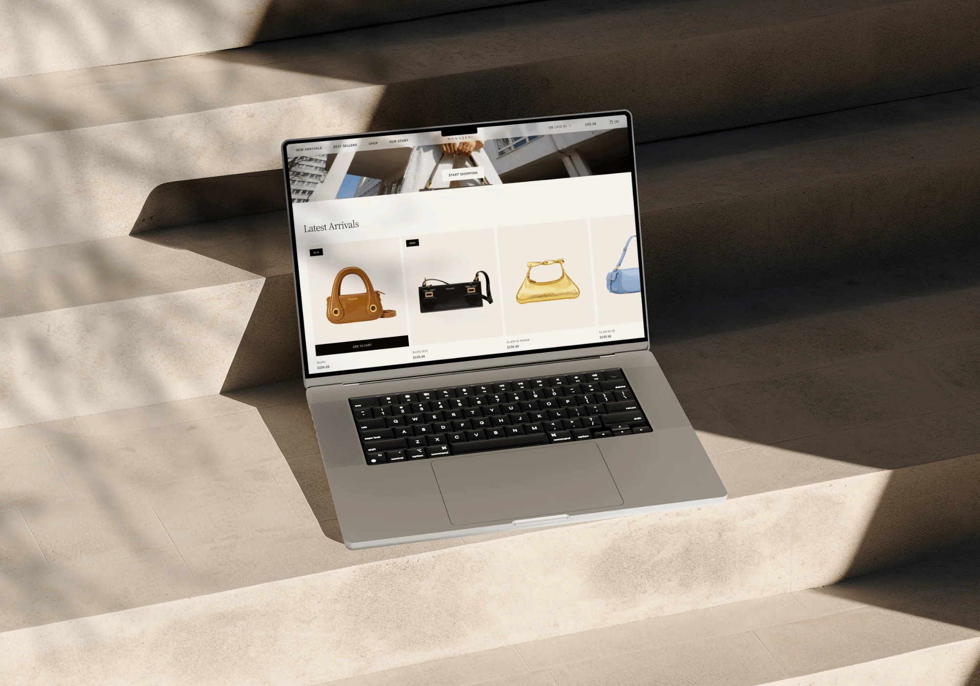
Monazeni was already generating sales, but the existing website wasn’t giving customers the experience expected from a contemporary fashion brand.
Users found the experience unintuitive, while the visual direction felt dated and lacked the energy and confidence of the products themselves.
For a fashion brand, that gap matters.
A website isn’t simply where someone buys a bag. It’s part of how they perceive the brand before they decide to buy.
The challenge wasn’t to make Monazeni look successful.
The challenge was to make the digital experience communicate that.
02
We started with a simple question:
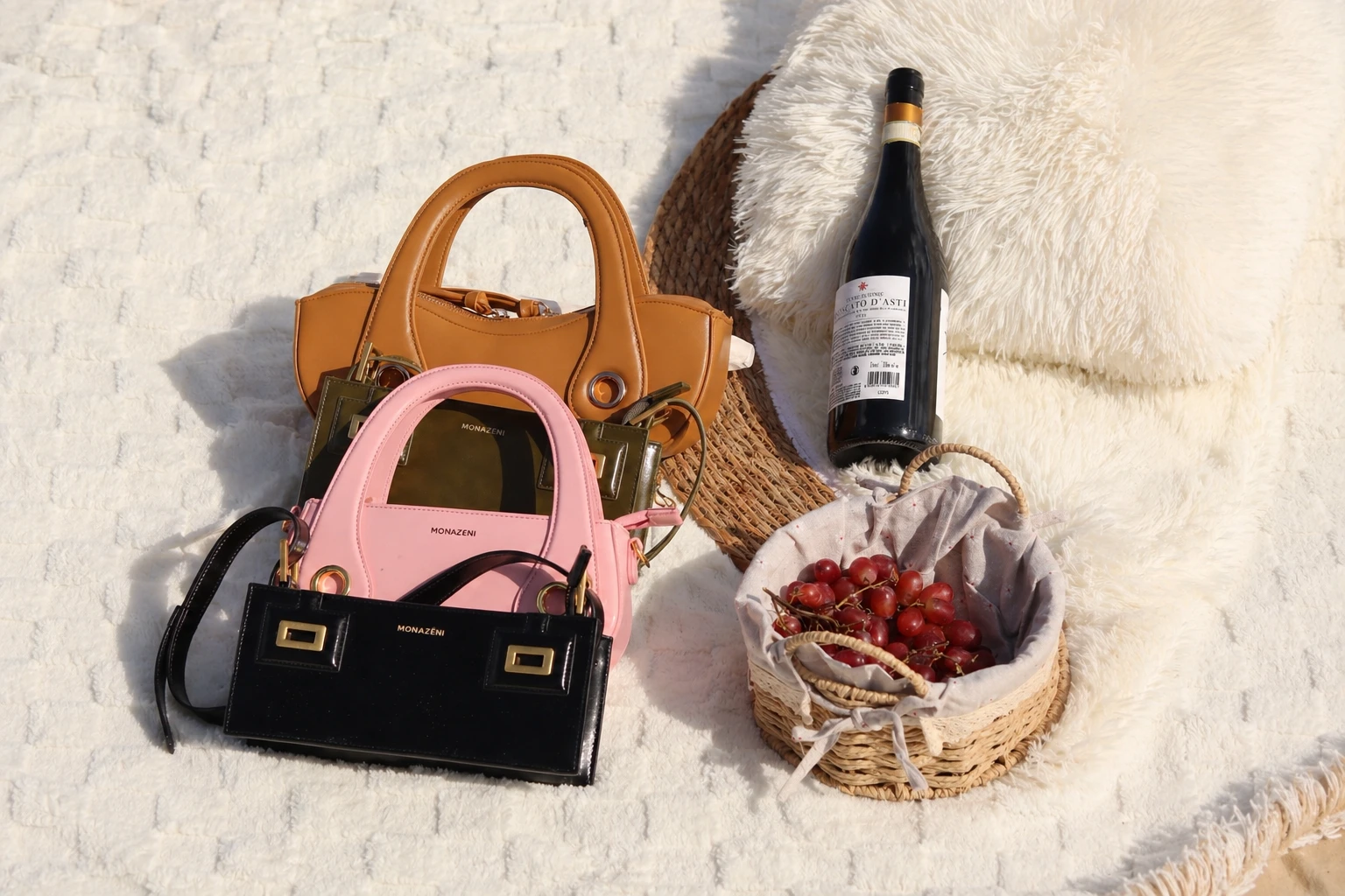
What should the Monazeni website feel like if its digital presence actually matched its reputation?
The answer wasn’t to add more. It was to make the right things matter more.
The goal wasn’t to reinvent Monazeni.
It was to make the website feel more like Monazeni.
03
Fashion ecommerce has a particular challenge.
The website has to sell a product while still preserving the feeling and desire surrounding the product.
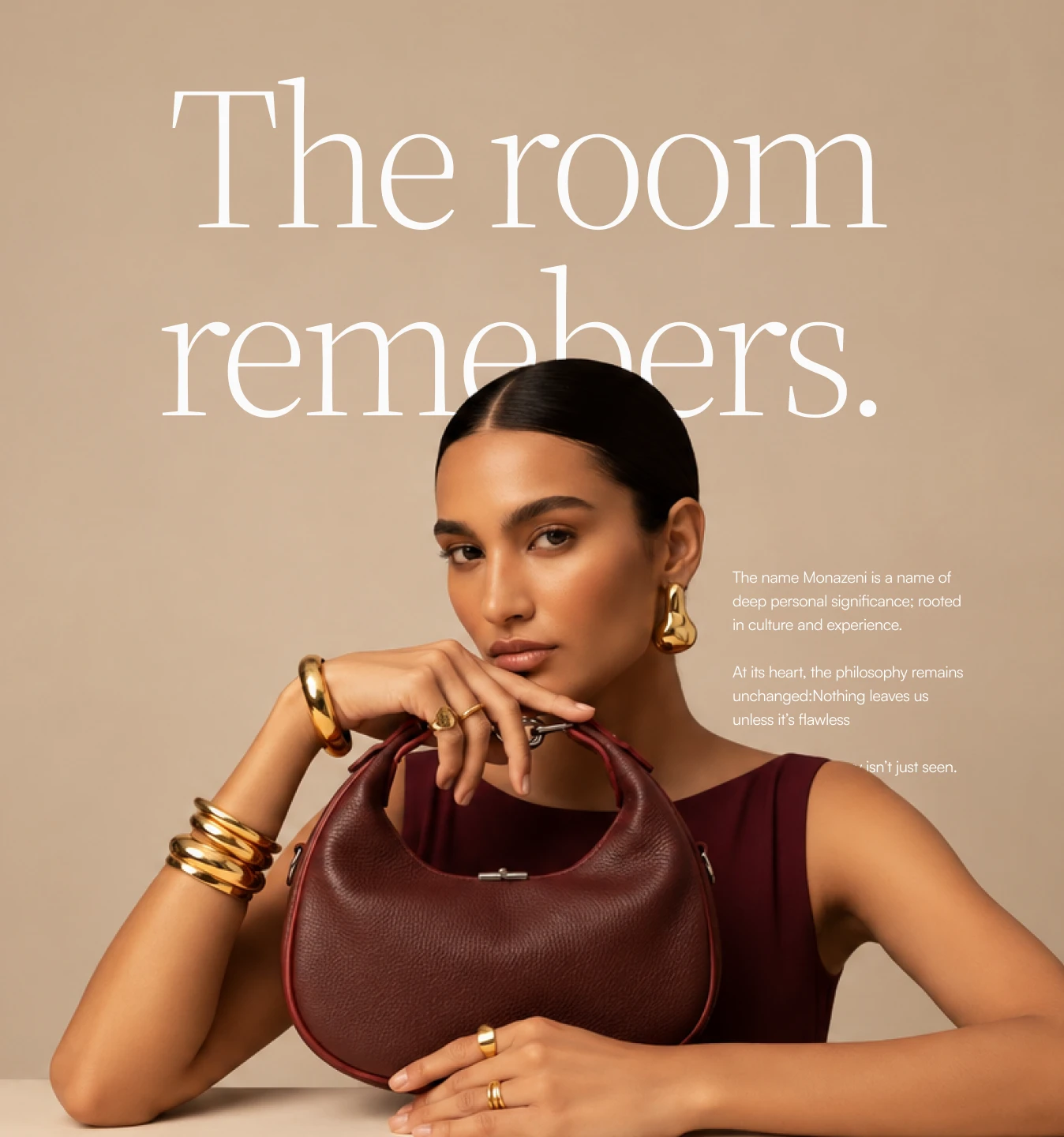
We didn’t want the bags to feel like items sitting inside a catalogue. We wanted them to feel like fashion pieces.
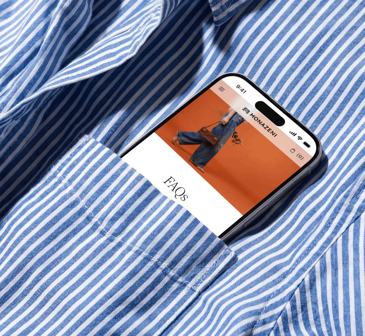
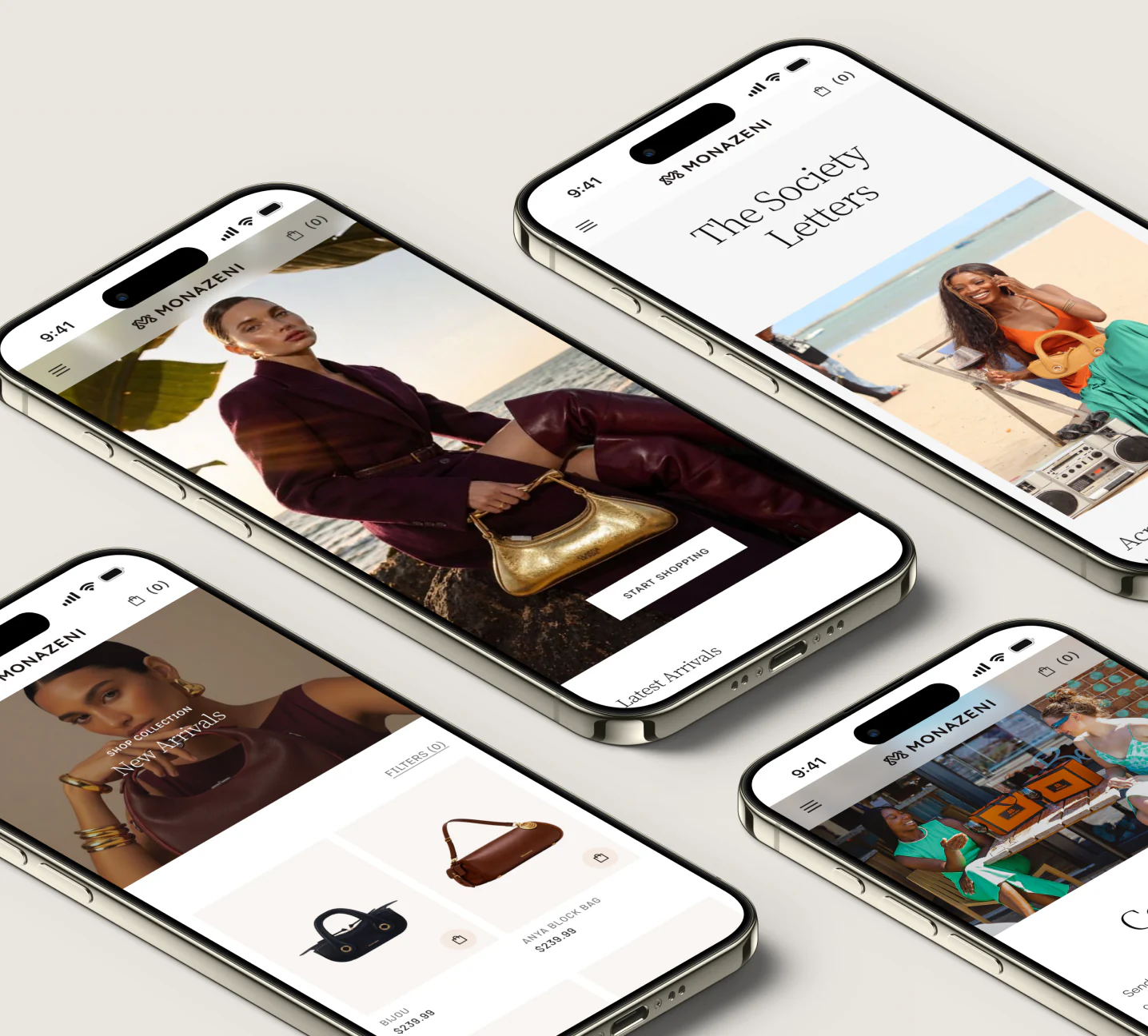
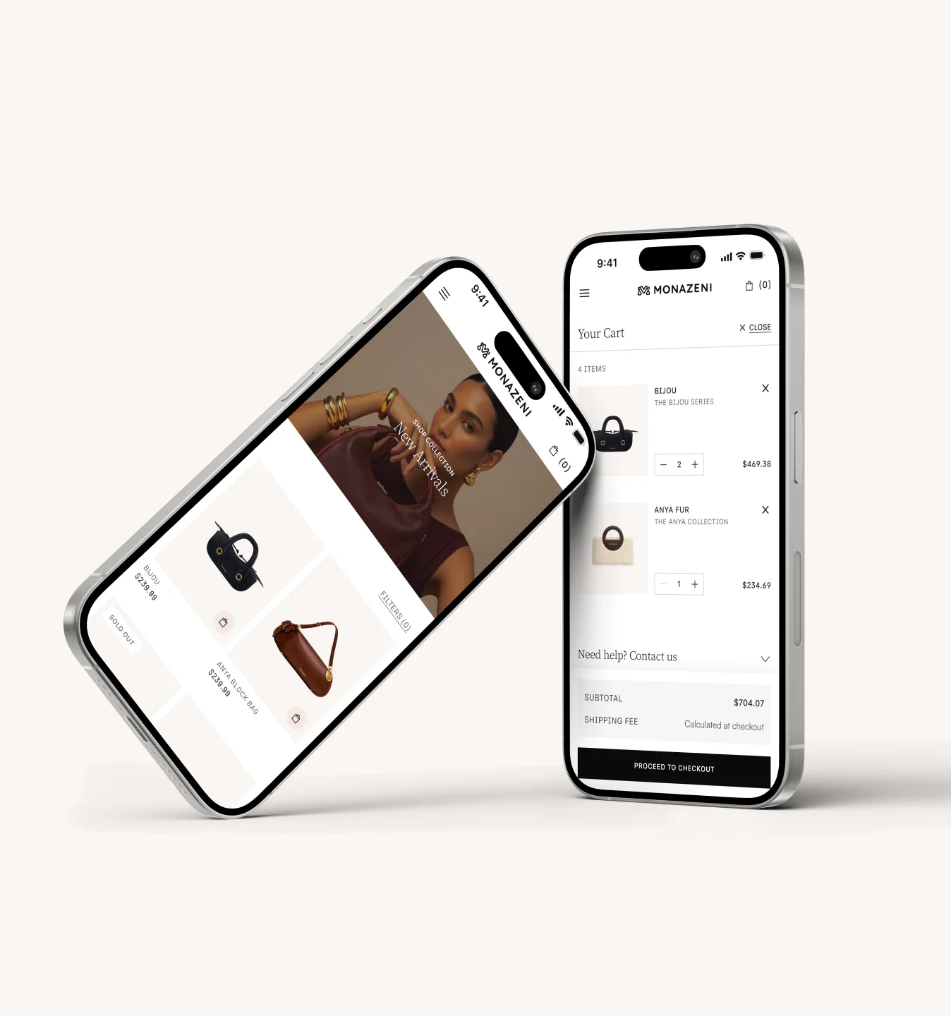
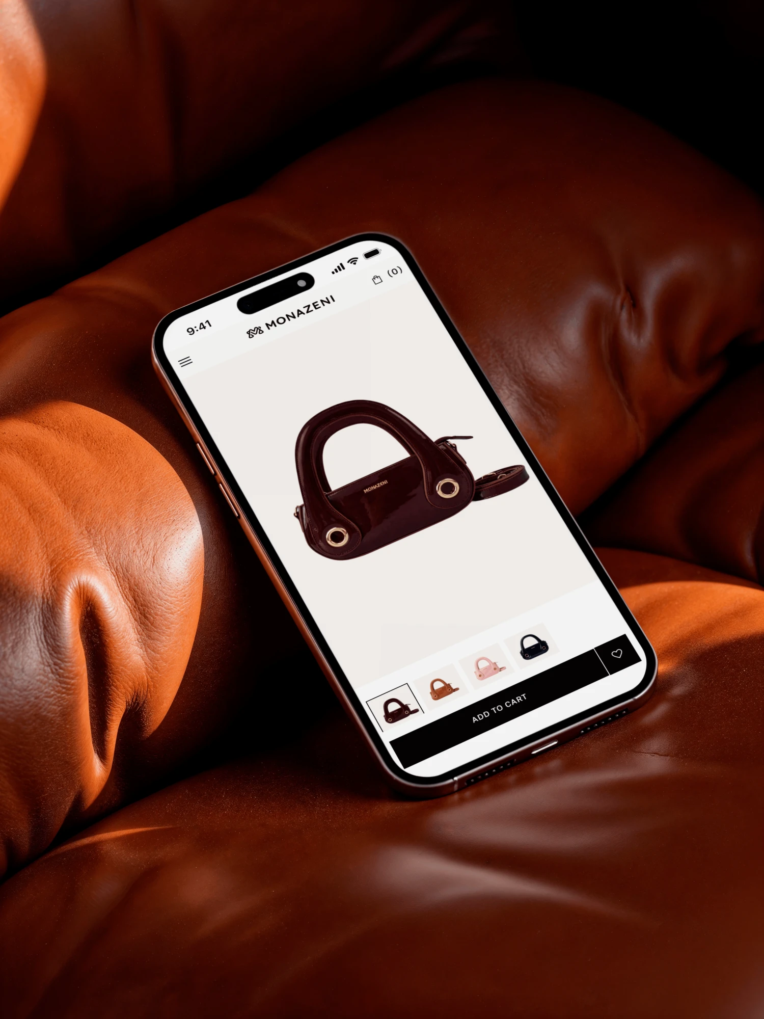
The visual system gives the products room to become the focal point, while typography, spacing, imagery, and composition work together to create a more editorial experience.
The result is a balance between brand expression and usability — a shopping experience that feels considered without getting in the way of the purchase.
04
A stronger visual identity wasn’t enough.
The experience also needed to make it easier for customers to understand the brand, discover products, and move through the shopping journey.
We reworked the hierarchy and structure across the site, making important information easier to find and creating clearer paths through the experience.
The redesign was considered across both desktop and mobile, ensuring that the experience maintained the same clarity and character regardless of how customers accessed it.
The result is a site that feels less like something customers have to figure out and more like something they can simply move through.
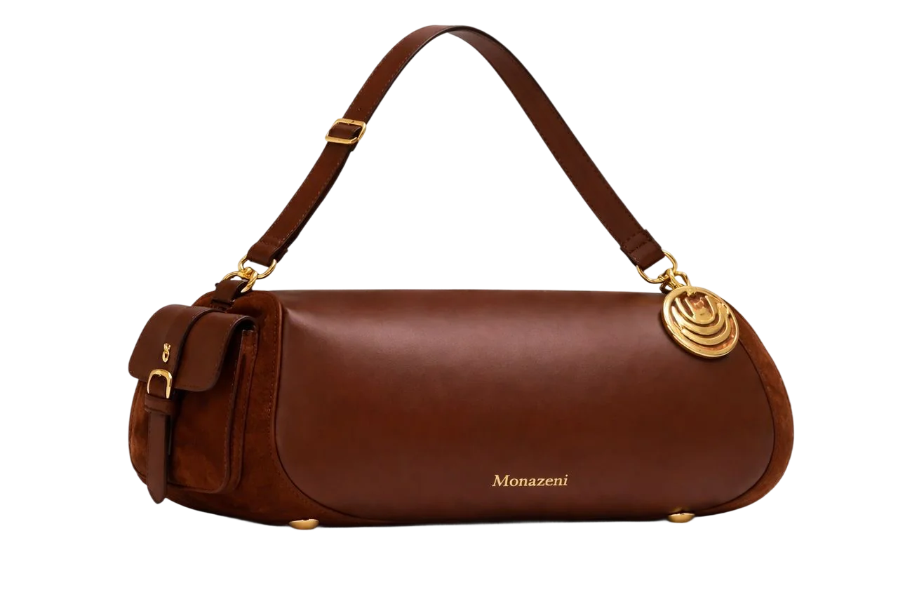
Anya Block Bag
$239.99
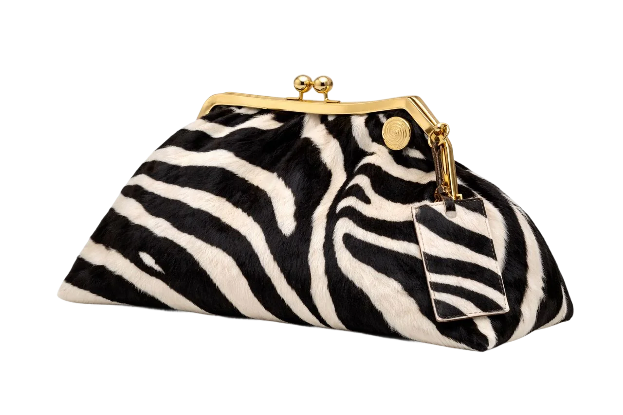
Anya Radio Bag
$239.99
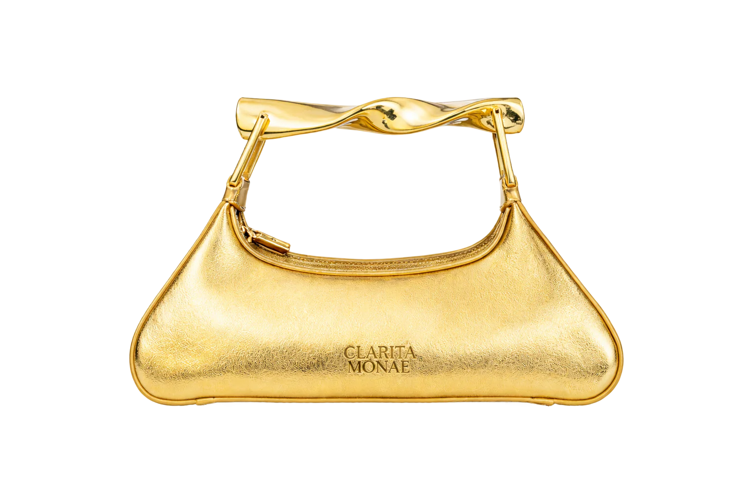
Clarita Monae
$239.99
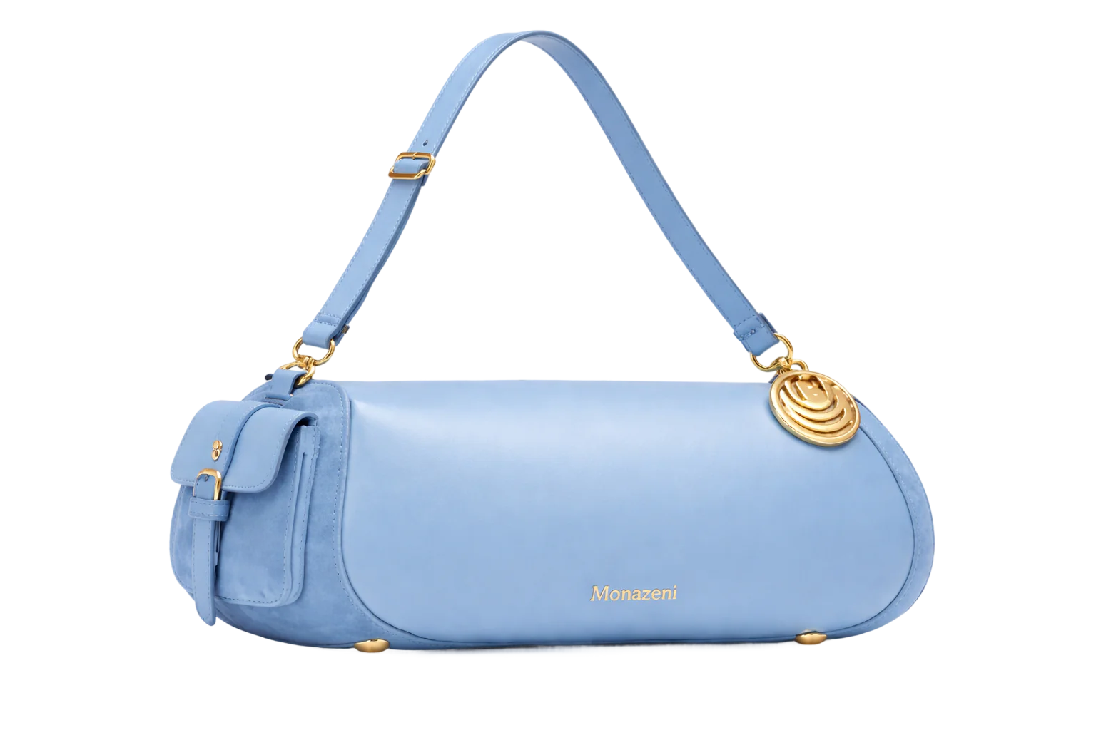
Elan Blue
$239.99
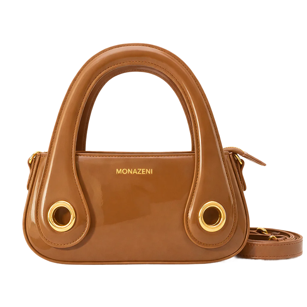
Bijou
$239.99
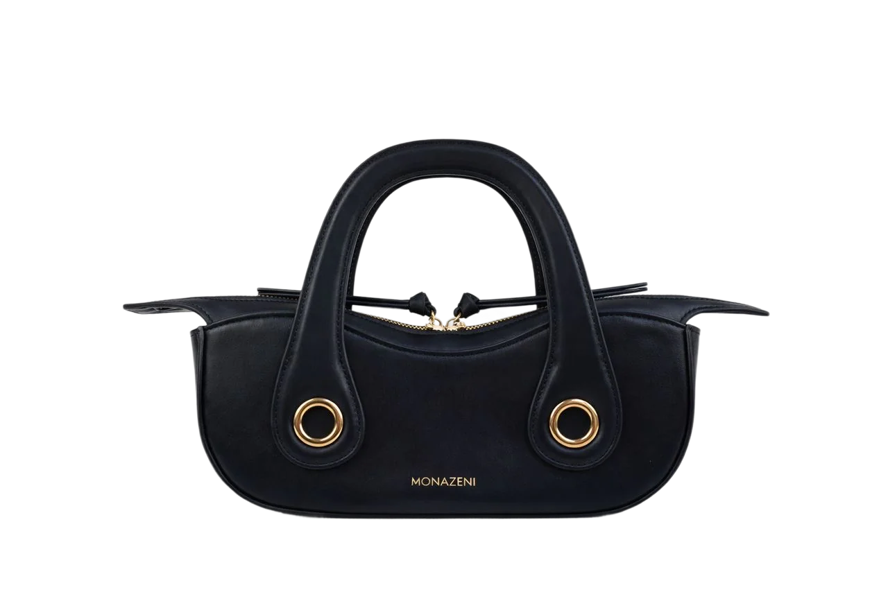
Bijou
$239.99
Anya Block Bag
$239.99
Anya Radio Bag
$239.99
Clarita Monae
$239.99
Elan Blue
$239.99
Bijou
$239.99
Bijou
$239.99
05
Monazeni didn’t need us to manufacture credibility.
It already had it.





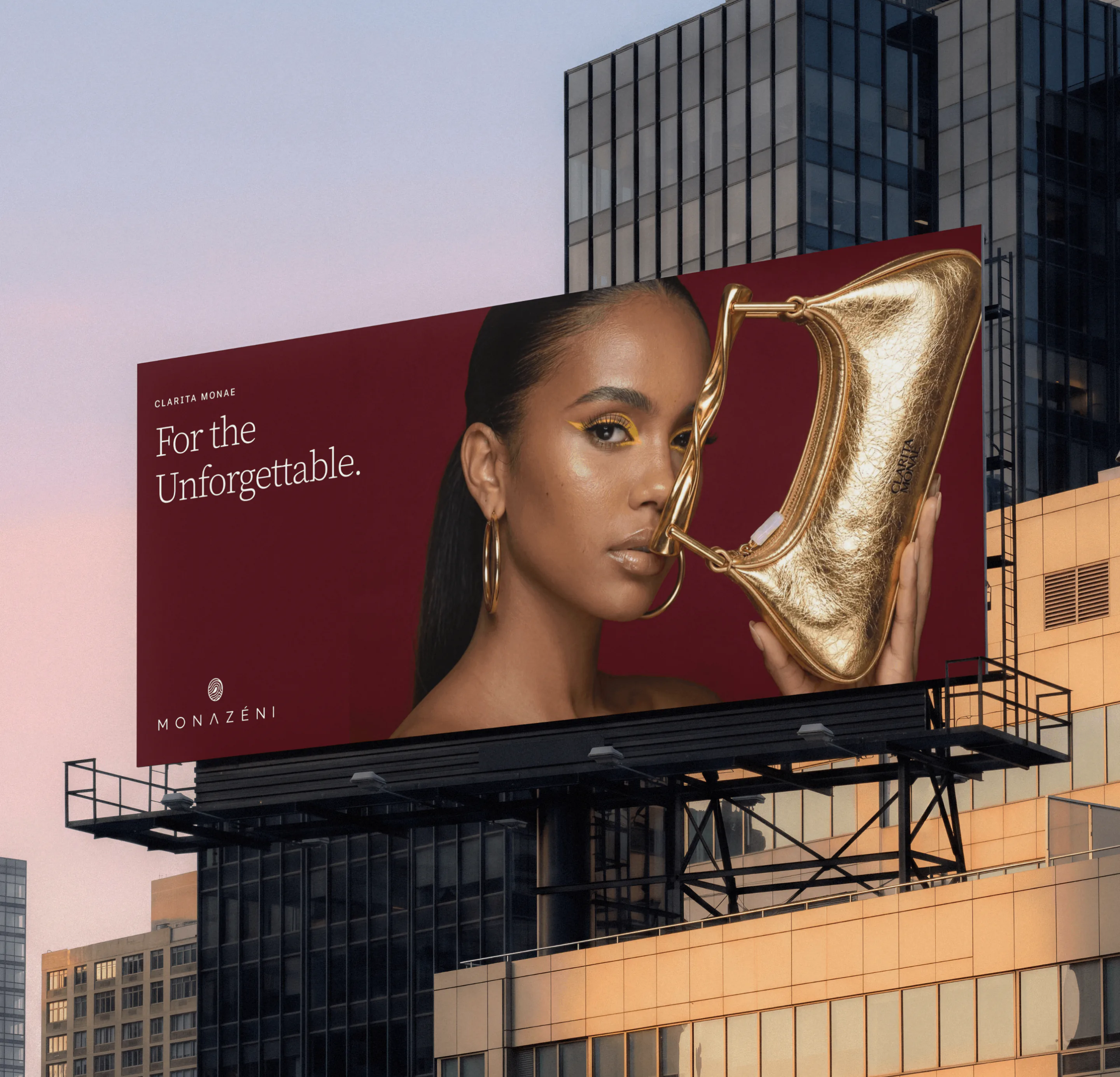
We saw that recognition as more than a list of achievements. It was evidence of the cultural relevance the brand had already built.
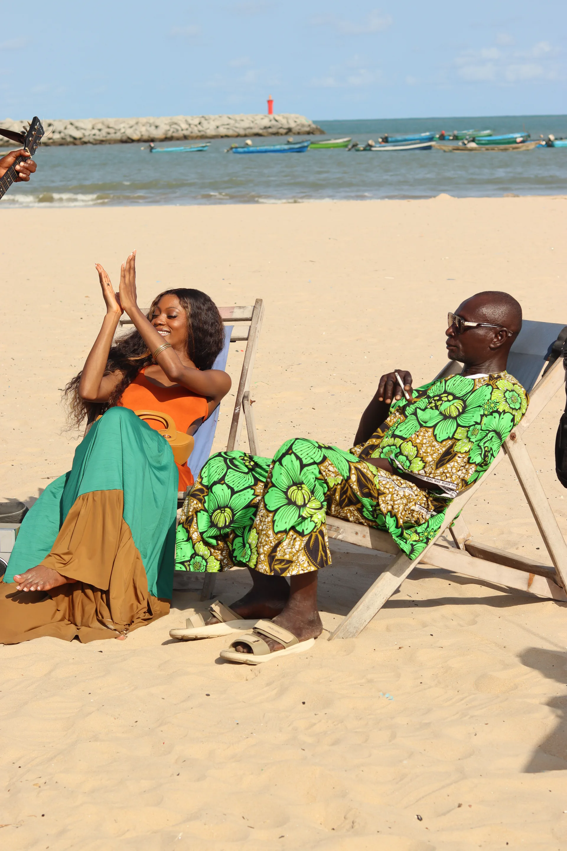
So rather than treating these features as footnotes, we made them part of the story the website tells.
The message becomes simple:
You’ve probably already seen Monazeni.
06
The redesign brings the digital experience closer to the level of recognition the brand had already earned.
The work wasn’t about making Monazeni look successful.
It was about making the website feel as established as the brand already was.
